There comes a moment that you lap consistent lap times, have your car under control, you use the fully available track width etc., but your progress in terms of getting faster has grinded to a halt. This is then probably a good time to start using your car's telemetry data. Telemetry means literally remote measurement.
This article on telemetry data is the 7th article in the Getting Faster series.
Modern racing cars are stuffed with sensors that can measure a ton of different things. This data can then be remotely read out and used to analyse your car's behaviour and related to that your driving style. Some of this data is read out real time while racing, other data is only read out when the car is in the pits (using cable or wireless technology).
In the most common racing sims, this (virtual) telemetry data is also available for analysis, so no fiddling around with sensors is needed here. This telemetry data is also typically used to compare different car setups (more on this topic later).
There are several good telemetry data analysis tools out there, free or paying, both for real life racing as for sim racing.
At racingmojo, we are a big fan of the rather new tool of Garage61. It strikes a good balance between being very intuitively to use (even for beginners in telemetry data read out), and the available feature set. It is still in alpha release though, but the new features are added at a high pace (something you would expect for racing software ;-)
Discussing telemetry data is a righteous rabbit hole on its own, that's why we have chosen to keep this blog article as high-level as possible. You can consider it as an introductory article to telemetry data analysis. Beside this Getting Faster series, we'll soon start a telemetry data series as well.
In Garage61 there are currently 7 data variables shown:
- Brake
- Throttle
- Steering
- Gear
- Racing line
- Speed
- Time delta
Note: in general there are many more types of racing car data available, but to keep it simple we'll stick to the most basic and fundamental ones.
In telemetry data analysis you mostly compare one dataset to another. Things you can typically compare are:
- try out different racing lines and see where you are gaining time
- compare car set-ups
- compare your lap to another driver's lap
- compare several laps to check tire degradation
- compare datasets to check the influence of track or ambient temperature
- etc.
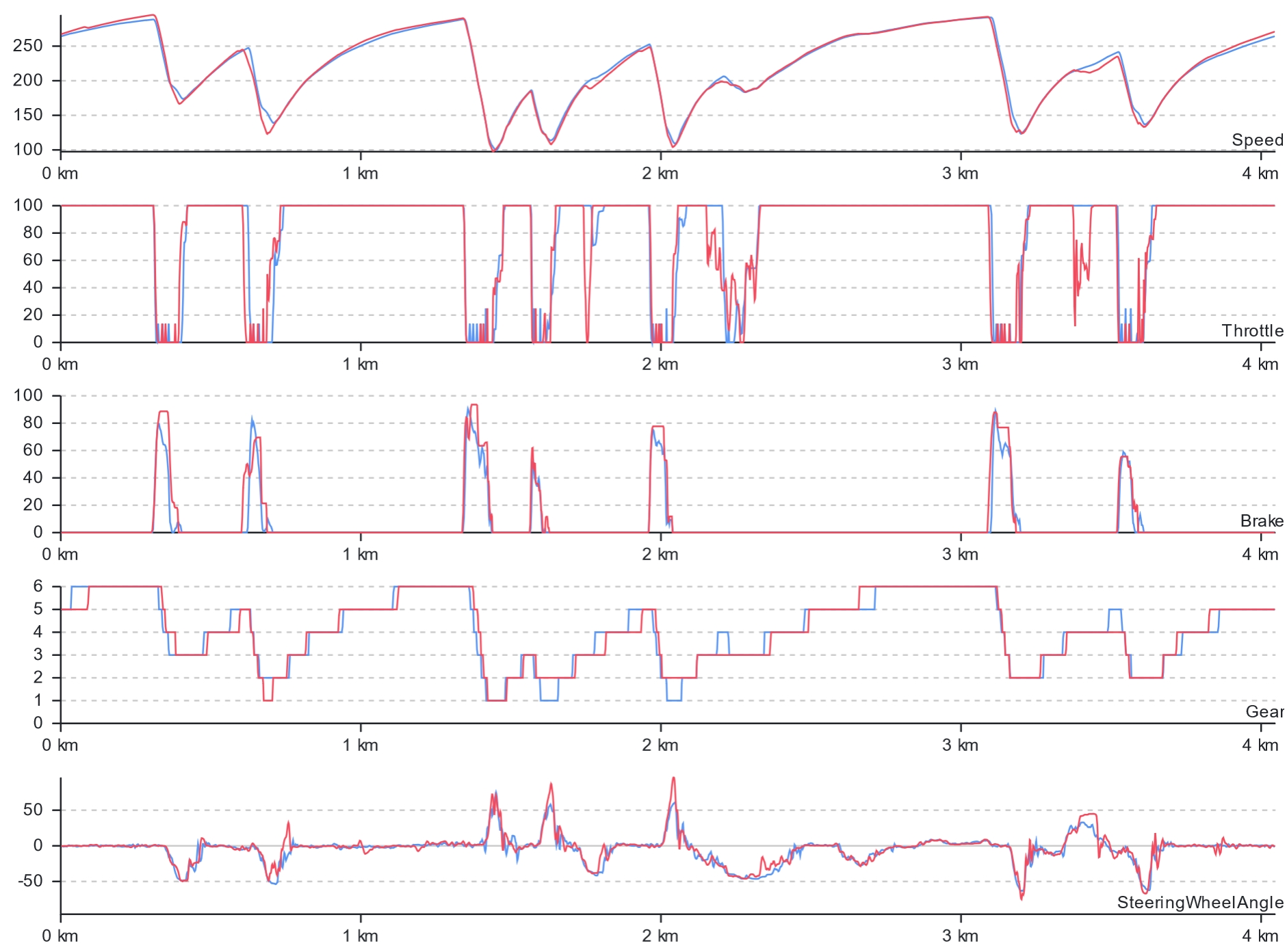
You can compare your driving data to that of others. All screenshots on this page are from the same comparison, I'm the red line and I'm this lap 1,248 seconds slower than the blue line. The graph below shows all data together, in the subsequent sections we'll discuss each variable separately.

Brake

Brake pressure (in %) in function of track distance is shown here. You can see that the red driver is braking harder and longer, but both drivers start braking at the same moment. The blue driver is also releasing the brakes faster. The goal of racing is to go as fast as possible, so the less you'll brake, the faster you'll be. This braking explains why the red driver is slower than the blue driver. The perfect horizontal red line probably is caused by locking up the wheels, resulting in less grip.
Throttle

This graph shows throttle (in %) in function of track distance. The spikes are caused by down shifting while braking. The red driver is on the throttle a bit earlier but probably too early because he had to release the throttle. The blue driver is smoother in increasing throttle. The sudden dip in the red throttle graph is caused by lifting the throttle in a corner. The red driver is lifting earlier and much more than the blue driver, resulting in lower corner exit speed, resulting in a slower lap time.
Steering

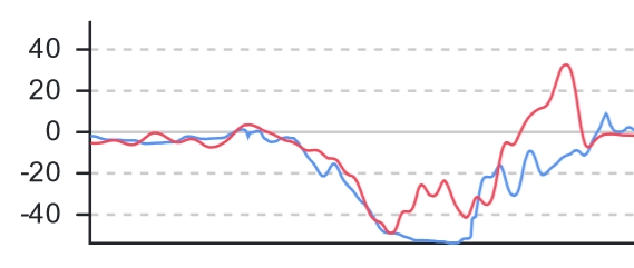
Here you see the steering angle in function of track distance. A positive number means turning left, a negative number means turning the wheel to the right. Both drivers turn to the right at the same location, but the red driver had to make a small correction when turning left again. Again, the blue driver is using the driving inputs smoother than the red driver. And you know what they say: smooth is fast(er).
Gear

Racing line

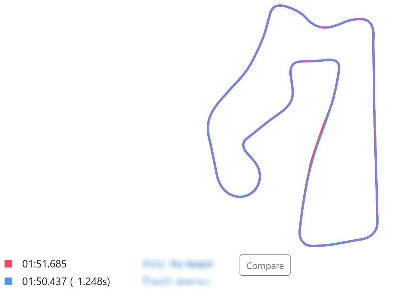
The racing line map shows the track from above, like a satellite would do. When not zoomed in the usage of this map is very limited, yes, you can recognise the track layout but that's it. Using the zoom function, you can really look at the details of the racing line of both drivers. Do you recognise this track? Yep, that's Road America.
Speed

The next graph is one of the more interesting ones: speed versus track distance. Here it is easy to see which driver is driving faster and in which corners. You should compare this information to the other graphs, and then you see what's the influence of braking, throttle etc. on your driving speed. The red driver comes in at a higher speed than the blue driver, they are both slowing down, and at a given moment the blue and red lines are swapping places: this clearly shows that the blue driver is maintaining a higher cornering speed than the red driver. At corner exit both cars are driving at the same speed. From this graph it's not always easy to see which driver is fastest over the full lap (because of the lines swapping places). The cruel judge in comparing lap times is the next graph: the time delta between the 2 cars.
Time delta

The time delta graph shows the total time difference between the 2 drivers/laps versus the track distance. In this example, positive delta means the red driver is faster, a negative number means the blue driver is faster. In this example you see that the red driver is faster in the first 700m of the track, but after that he is losing ground to the blue driver. The vertical dips on the graph indicate where the most time is lost, the horizontal parts mean that both drivers have the same speed. From this graph, there are 3 areas where the red driver should be looking for extra speed: the vertical dips at 700m and 3100m, and the area between 1500m and 2200m. The latter is probably because of a big difference in cornering exit speed. On this graph you can also read out the final time difference over one lap, being 1,248 seconds.